View case info +
Bitwave
Branding
UI / UX Design
Motion Design
Brand Guidelines
Webflow
MAKING WAVES THROUGH GAMES
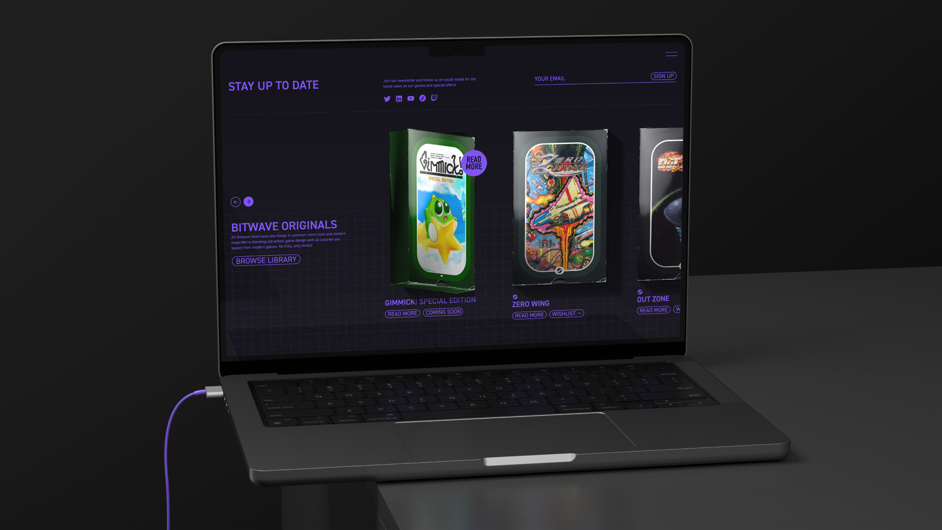
Mixing all the best parts of past, present, and future, Bitwave Games creates high-quality, retro-inspired gaming experiences that are fun and accessible to all. Once they changed their name from Retroid to Bitwave, we took on the challenge of designing a whole new look and feel for their brand.
A JOYFUL BLAST FROM THE PAST
Most of Bitwave's gamers are in their 30's and have a nostalgic connection to the aesthetics of the games they played as children. When creating Bitwave's new visual identity, we used the technological limitations of the past as identity carriers and expressed them through graphic elements, animation, and sound.
OLD SCHOOL COOL
An affectionate callback to the Super Mario Bros. games from the 80s, we transformed the logo into a low-resolution wave without spatial anti-aliasing. This form also mimics the sawtooth wave known in music, inspiring us to work with a musician and create a signature sound for the brand, reminiscent to what is heard when playing 8-bit game consoles.
LESS WORKS BEST
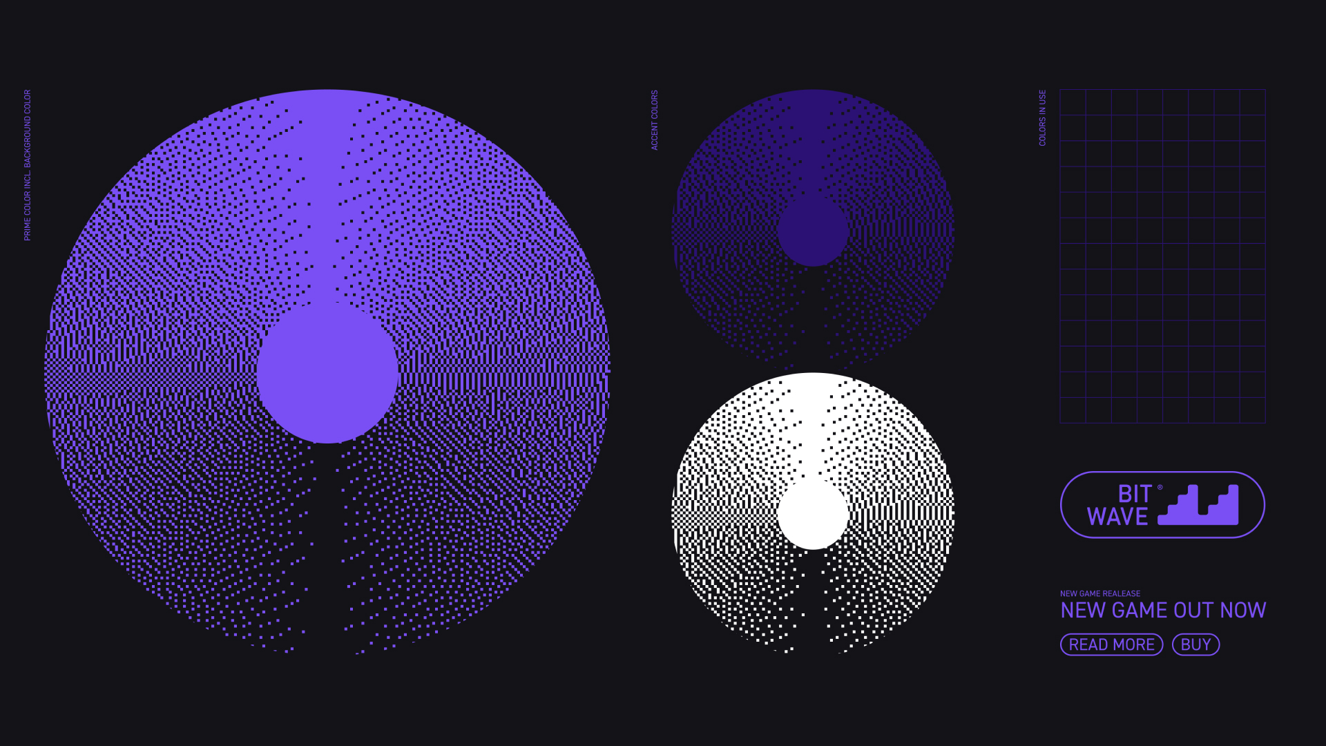
For a truly sentimental user experience, we applied a custom dithering technique to graphic elements and animations using a two-toned color palette. Unlike the small, round dots produced when dithering with a printing press, we simulated images using large, square pixels to create a more cohesive retro theme.
More work
- 01 Perfect Day Media
- 02 Stadshem
- 03 Artka
- 04 Bitwave
- 05 Karltex.se
- 06 Wint
- 07 Gothenburg International Film Festival
- 08 Timber APP
- 09 Älvrummet
